In modern visual communication, clarity is more than an aesthetic preference—it is a functional requirement. When engineering the brand identity for Emerge-X, our creative team was tasked with building a forward-looking, highly reliable narrative that signals progress, seamless navigation, and decisive action. By drawing structural inspiration from universal architectural and informational icons, we built a brand mark that stands as a literal and figurative pathway forward.
1. The Core Design Synergy
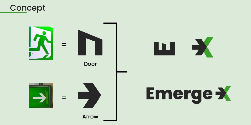
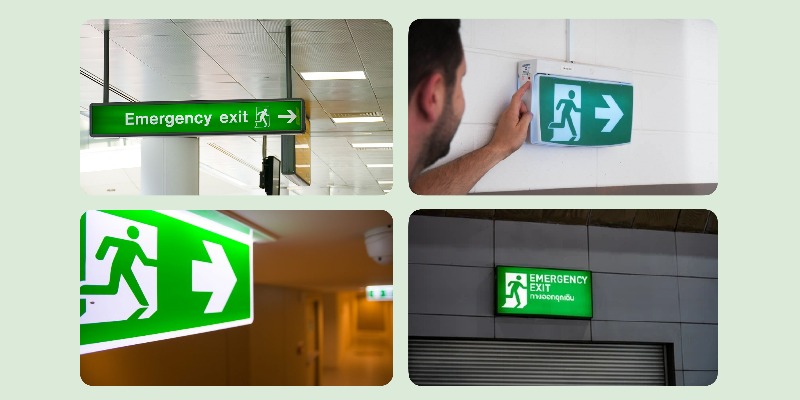
The genesis of the Emerge-X identity relies on a literal interpretation of “emerging” or finding direction. We extracted and refined primary geometric components from standard informational signage to create a harmonious hybrid symbol:
2. Strategic Color System
Color psychology plays an indispensable role in trust and safety mechanics. The Emerge-X palette utilizes two primary corporate tones balanced to provide excellent contrast ratios for print, digital UI, and environmental fixtures:
Wageningen Green (#3DA229): RGB (61, 162, 41) | CMYK (62%, 0%, 75%, 37%). This specific hue evokes safety, freshness, technical readiness, and operational compliance. It guarantees peak visibility while paying heritage tribute to classic guidance systems.
Charleston Green (#272727): RGB (39, 39, 39) | CMYK (0%, 0%, 0%, 85%). A deep, premium near-black charcoal that provides corporate stability, structural anchoring, and professional authority without the stark harshness of pure black.
3. Typography & Geometric Alignment
To preserve structural unity, the logotype relies on the typeface Poppins. Poppins is a highly geometric, clean, and minimalist sans-serif family that optimizes readability at any distance or scale.
Modern & Innovative Appeal: The circular bowls and linear terminals align effortlessly with our technical imagery.
Corporate Authority & Sophistication: Poppins creates immediate technical credibility and user trust, reinforcing Emerge-X as an innovative leader in its field.
4. Real-World Application & Adaptability
A truly versatile corporate asset must perform perfectly across contrasting spaces. As captured in our production templates, the Emerge-X system transitions effortlessly across formats:
1. Light Backgrounds: The deep Charleston Green text reads flawlessly, punctuated by the vibrant green arrow tip.
2. High-Contrast Dark Environments: On charcoal or deep green banners, the logotype shifts smoothly to solid white, ensuring the brand remains visible under challenging lighting conditions.
3. Monogram Scaling: The icon standalone (The ‘➔X’ glyph) scales seamlessly down to a micro-sized mobile icon, favicon, or up to large-scale facility exterior signage.