
1. Brand Strategy & Core Philosophy
1.1 Executive Summary
Pocket Meal is a disruptive culinary brand designed to bridge the gap between fast-paced modern lifestyles and premium, wholesome food solutions. The core mandate of the brand is absolute portability without compromising culinary craftsmanship, freshness, or structural aesthetic.
This document outlines the exact design systems, parameters, and application philosophies required to maintain absolute brand consistency across digital storefronts, marketing touchpoints, and functional food packaging systems.
1.2 Target Market Positioning
The visual language reflects an intersection of two contrasting consumer paradigms: urban utility and premium gourmet satisfaction. The identity avoids the industrial coldness of typical meal prep companies while steering clear of overly rustic, impractical restaurant motifs. It occupies a distinct "premium convenience" sector.
2. Logo System & Structural Anatomy
2.1 The Container Motif & Silhouette
The primary mark centers around a structural container—evoking the visual familiarity of a classic layered bento box, stacked tiffin, or precision thermal flask. This silhouette acts as a literal containment system for the brand assets, directly reinforcing the name "Pocket Meal."
2.2 Iconographic Integration
Embedded cleanly into the upper handle architecture is a minimalist spoon line accent. This element provides immediate contextualization, transforming an abstract storage silhouette into an explicit culinary signal. The iconographic lines maintain geometric parity with the container frame, preventing visual fragmentation.
2.3 Author Signature Anchor
Positioned explicitly underneath the base curvature of the container is the signature BY ESHAAL DARBAR. This micro-typography functions as a mark of culinary ownership, elevating the product from mass-produced utility to a designer food experience.
2.4 Lockup Specifications
The typography is strictly nested inside the vertical parameters of the main container shape. No elements should bleed outside the defined perimeter border except for the upper structural handle and utility spoon.
3. Color Architecture & Specifications
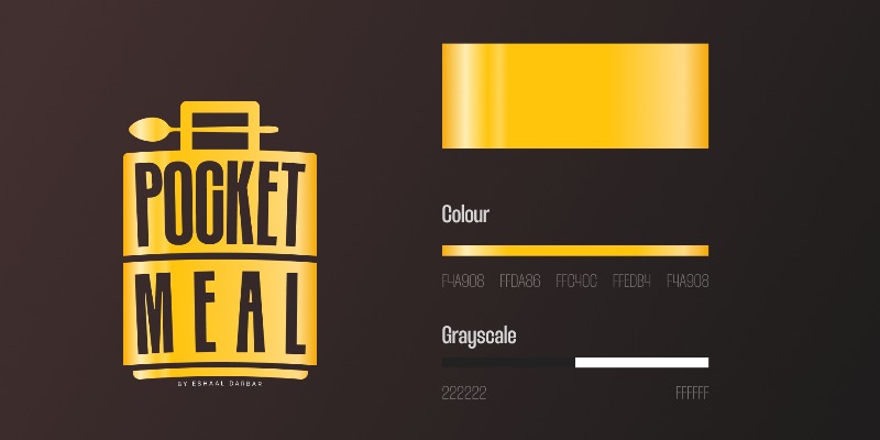
The brand utilizes a high-contrast palette consisting of an opulent metallic gold spectrum set against an ultra- rich, dark charcoal background. This pairing ensures high visibility and commands shelf-presence in physical environments.
3.1 Corporate Color Palette
The brand utilizes a high-contrast palette consisting of an opulent metallic gold spectrum set against an ultra- rich, dark charcoal background. This pairing ensures high visibility and commands shelf-presence in physical environments.
3.2 Grayscale Adaptability
For mono-printing, newspaper layouts, or high-volume thermal utility receipts, the logo must adapt seamlessly into binary states:
Positive Monochromatic: Absolute solid black charcoal (#222222) on solid white substrate.
Negative Inverse Monochromatic: Pure white (#FFFFFF) knocked out from a solid deep background element.
4. Typographic Infrastructure
4.1 Primary Typeface: Thunder Bold LC
The definitive typographic expression for Pocket Meal is Thunder Bold LC. This font was systematically chosen due to its ultra-condensed properties and heavily structured vertical orientation.
4.2 Structural Mechanics
Because the brand relies on maximizing presence inside a constrained "pocket," the heavy vertical weights and minimal horizontal kerning of Thunder Bold LC allow the text to act as a solid physical brick within the container logo structure.
TYPOGRAPHIC ALPHABET REFERENCE TRACK:
 Uppercase: ABCDEFGHIJKLMNOPQRSTUVWXYZ
 Lowercase: abcdefghijklmnopqrstuvwxyz
 Tracking Style: Extremely Tight / Condensed Solid Fit
4.3 Hierarchy System for Brand Media
Main Document / Display Titles: Thunder Bold or equivalent geometric ultra-condensed sans-serif (All Caps).
Section Sub-headings: Medium weight clean geometric sans-serif with increased tracking to contrast the tight logo text.
Body Text: High-legibility system sans-serif (e.g., Helvetica Neue, Arial) rendered at 10pt–11pt to maintain crisp data consumption across packaging instructions and nutritional tables.
5. Patterns & Tapestry Integration
5.1 The Geometric Folkloric Tapestry
To prevent the brand from shifting into a purely corporate or mechanical vibe, a specialized horizontal geometric folkloric pattern has been developed as a foundational asset. This complex pattern acts as a visual anchor on packaging and secondary assets.
5.2 Strategic Intent
The pattern injects a narrative of cultural heritage, kitchen tradition, and artisanal preparation into the system. It balances the modern, hyper-condensed typography by signaling that the contents of the pocket pouch are crafted with authentic, multi-layered culinary values.
5.3 Layout Placement Rules
Trim & Margins: The pattern should ideally run as a horizontal border band along the base margins of paper bags, coffee sacks, or belly-band packaging sleeves.
Opacity Constraints: When utilized over dark charcoal backgrounds, the pattern should remain subtle, printed with a low-contrast specular tint or varnished overlay. On white packaging surfaces, it should execute in a multi-toned warm terracotta and deep charcoal color layout.